It's the little things
I've been thinking about the little things that can be changed to make a web page easier to use. Seemingly small changes can add up to have a big impact on the way people will interact with the page.
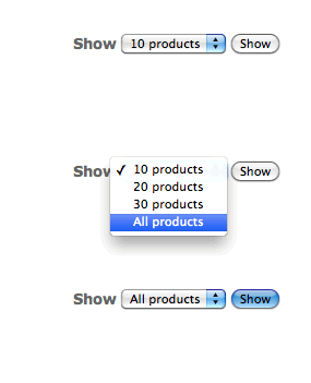
On one particular site, I have a pretty standard widget used to select the amount of products to show per page. I'm sure you've seen something similar to that of below on many other websites.

The way this is currently implemented, it takes three clicks to complete the intended operation. This could be reduced to two clicks by adding some JavaScript to trigger the page change (and removing the button), but there is a problem with this method: The options at not all visible at once. You have to click to see what the options are.
Rethinking the implementation
I decided to change the way this was implemented, moving to a horizontal list of links.

The advantages of this approach are:
- You can see all options at once. Please, don't make me think.
- It's only a single click to select an option.
- It's better for accessibility because you don't have to fiddle with a dropdown (and who wants to?).
I think this is a fairly good example of how changing small things, perhaps even those that seem inconsequential, can contribute to improving the overall experience of the page, and delight the user.
